Dark Themes - Who Needs Comments Anyway?
Dark themes are all the rage, and have been for a few years now. On the one hand they can be great, on the other they sometimes still suffer from the same problems I encountered when trying to tweak my *nix desktops to be dark fifteen years ago - elements sometimes get missed, and either stand out horrifically, or simply get lost. Just today I logged into the Office 365 admin tools for our business, to have one of those "what's new" tours appear where you see a bunch of tool-tip style popups, one after the other, show you around new elements on the screen - what was conspicuous in it's absence was the 'Next' button on the first one. Of course, when I hovered my mouse where I expected a button to be it suddenly appeared in bright, unmissible orange, and when I moved it away I realised it was there all along, it was just very dark grey on a black background. It wasn't Disaster Area's sun-diving stuntship bad, but it was pretty bad.
Where Are The Comments?
As you may have surmised from the title, this post isn't just about dark themes, it's about comments. Specifically it's about how comments appear in dark themes in IDEs. Checkout these screenshots taken from my IDE with some of the most popular (based on blogs, ratings etc.), and look at the comments. The problem in my opinion (yes this is an opinion piece, and yes, you may disagree) is pretty clear: comments in dark themes are often configured to use colours that do not contrast well with the background. To my mind, this makes absolutely no sense, and it's infuriating.
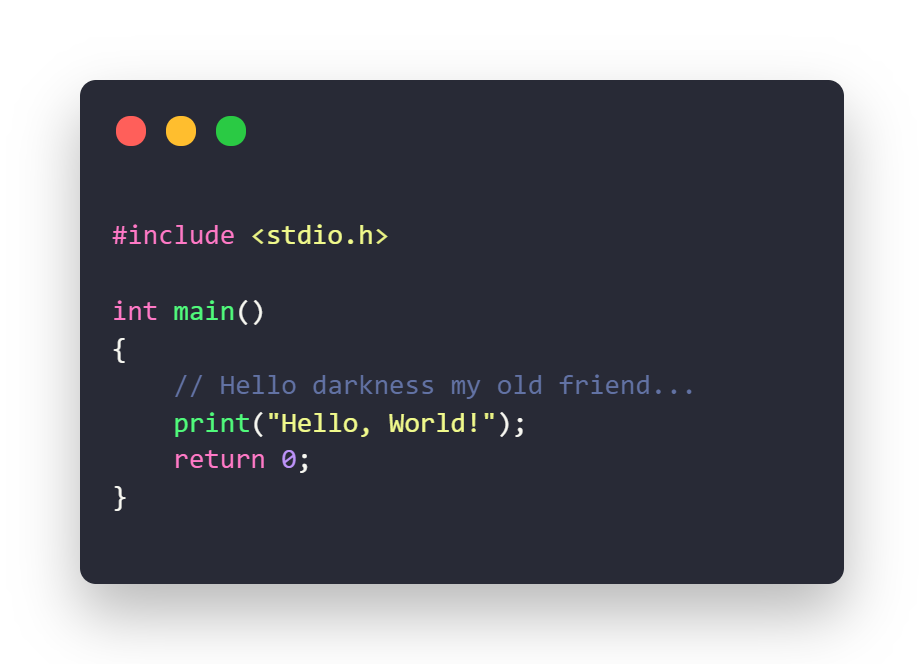
Dracula Official
A pretty standard take on comments in dark themes.
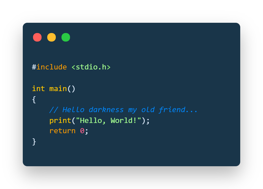
Cobalt2
This is the best of the bunch here, blue on blue isn't ideal but at least there's a reasonable difference in brightness.
Night Owl
I like the colours in this theme, but the comments need to be brighter.
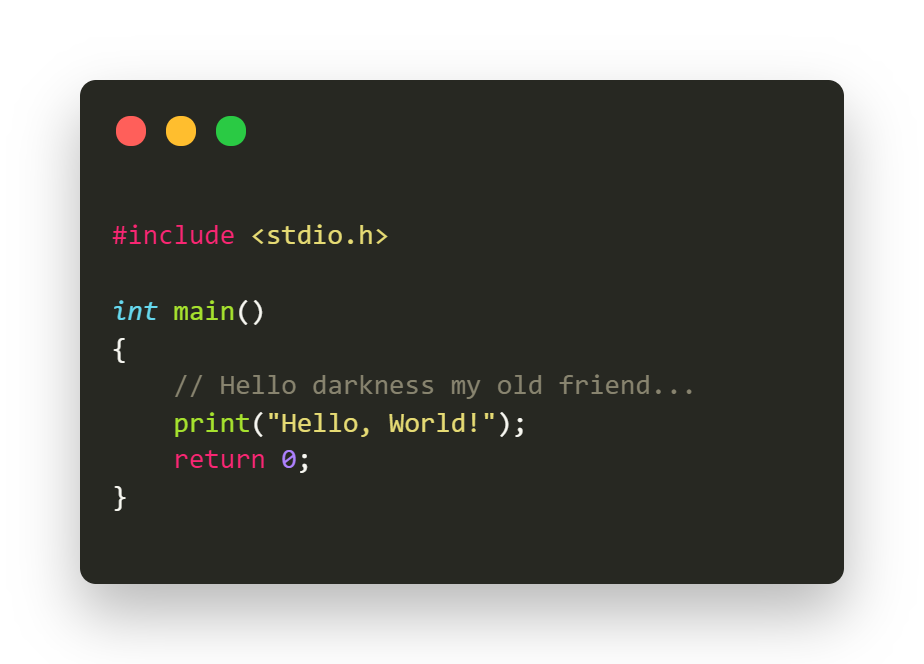
Atom One Dark
Given it's popularity, it surprises me how much these comments just blend into the background. If you squint your eyes they pretty much vanish.
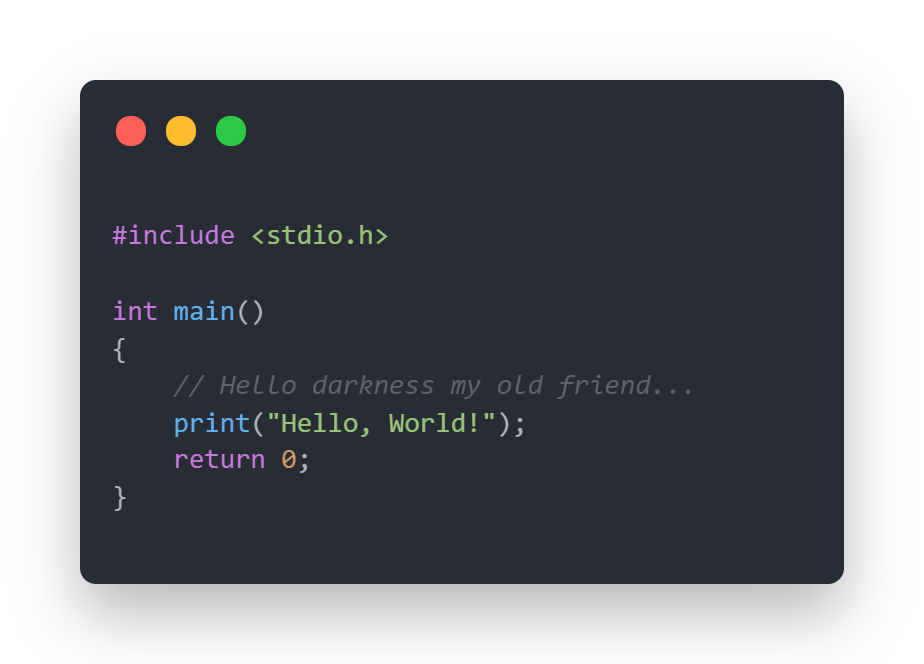
Monokai Dark
Not much better than Atom, used to be my default until I switched because of the comments.
It's as if comments are regarded as messy, unsightly, or that they're somehow less important than the code around them. Sure, comments such as // set name to null or // loop over the array are essentially worthless, but good comments are worth their weight in bitcoin. Good comments are arguably more important than the code around them, because although reading the code tells you what it does, only comments can tell you why it does it, and there's many occasions where the why isn't immediately apparent. Comments alone can tell you why some ass-backward crazy looking code is written as it is - oftentimes there is a good reason for weirdness.
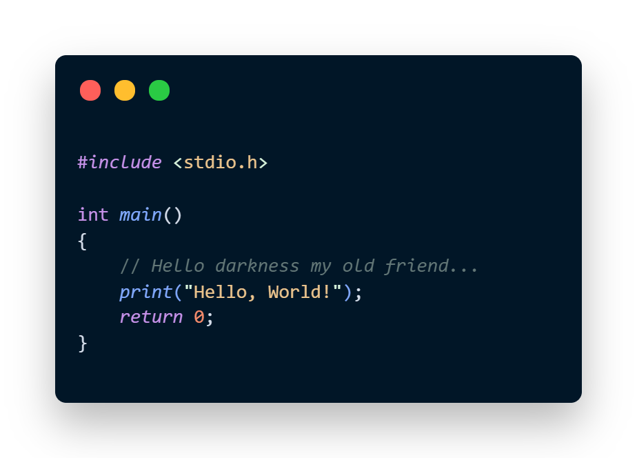
Codey's In Bed By 10pm
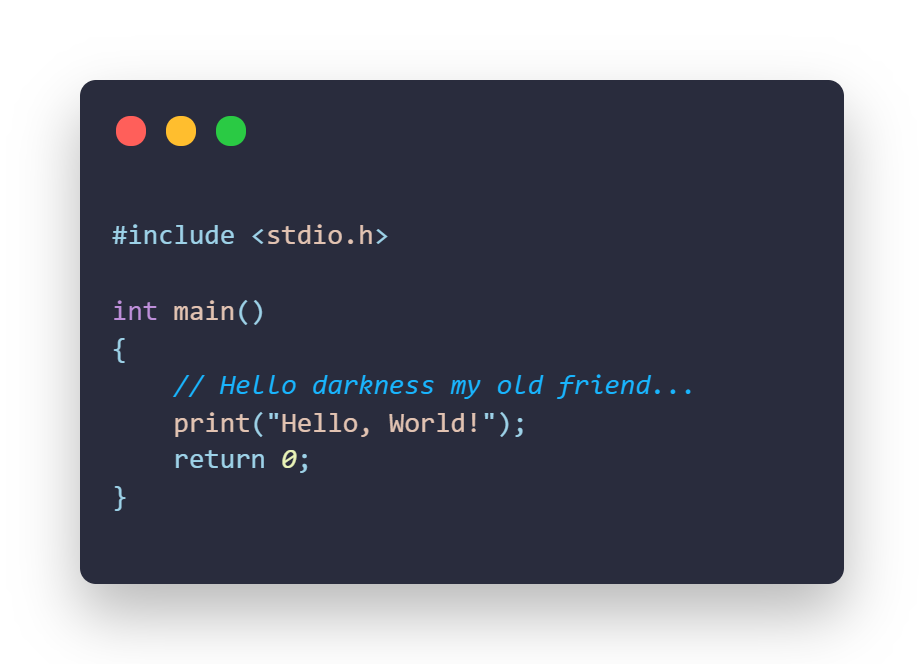
Respect your comments. Put effort into writing them, and let them stand out by using a theme that appreciates the power of comments. A good example of such a theme has been cooked up by a good friend of mine, Kevin Poorman, called "Codey's In Bed By 10pm" and I thoroughly recommend checking it out. On the surface it might appear that the comments and background are on par with Cobalt2, but the difference is the contrast for the code and the comments appears to be very similar, they're treated as equals, as all code and all people should be.